Capturing Personality: Bag People
This was a 2 week project | Spring 2023
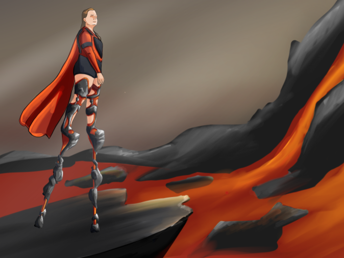
Objective: try to communicate the essence of a person, in this case one of my Professors Dr. Sebastien Proulx, in the design of a bag.
This project emphisized visual communication of abstract ideas, representing emotional or behavioral qualities in physical product changes. This bag is designed to feel both imposing and eccentric, functional but far from utilitarian.
Exploring Visualization Styles
This is a two week project | Spring 2022
This project was to expand my visual library by attempting to recreate a visual style from an inspiration source. I chose to redraw my woven office light design in the style of Stephen Swelzler, a car illustrator. It was a challenge to recreate his style on a very different subject and different media, but it was a fun challenge.

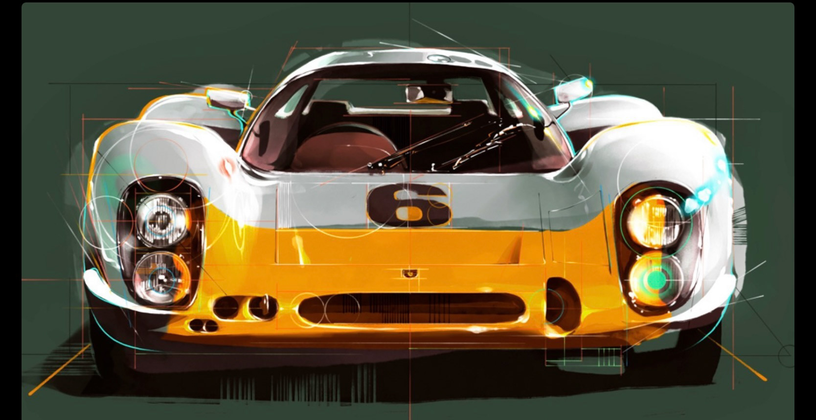
On the left, the woven lamp I was drawing, on the right my biggest inspiration from Swelzler's work.
Trippin' Rollercoster Visual Design
This is a four week project | Fall of 2021
Designing and visualizing some sort of protective gear or system.
Trippin' is a concept design for a rollercoaster seat and restraint. The seat is fashioned to reflect a nostalgic style and visual language, picking up on the technology and furniture of the early 1970s. It's earthy color palette, curvy shapes, and bright splashes of blue are meant to invoke imagery of psychedelia and the later parts of the hippie movement. The coaster itself is a hanging coaster, with and over the shoulder lap restraint. The lap restraint is the primary contact with the rider, providing all of the hold of the restraint. The metal over the shoulder bars are meant only to hold the lap restraint in place. The grip bar shape and overhang shape both call back to the detailing on the lap restraint. It is essentially, the most important piece of this protective gear.
In terms of process, the seat and restraint were developed simultaneously to create more harmony between their forms. Starting with front and side thumbnail sketches, I then mixed and matched the seats and restraints to find which worked best together. Moving into the 3D space, the overall form of the 7 most promising was displayed in 7 perspective sketches, adding light shading and color for clarity. These sketches are coded by seat a restraint position from the original thumbnail set. From there, with feedback, I chose a single form, and started iteration again on details for the form, the restraint fit, grip shape, and color palette. After a few perspective version of my favorite features, using my original perspective as an underlay, I chose two of the same form but with different color palettes. With another round of feedback I went into final sketches, 3 orthographic views, 1 finally visualizing the seats together as a car, and one final perspective render. This can all be found on the process poster, or in the detail images included.
Visual Brand Language Project Nov 2021
This is a two week project | Fall 2021.
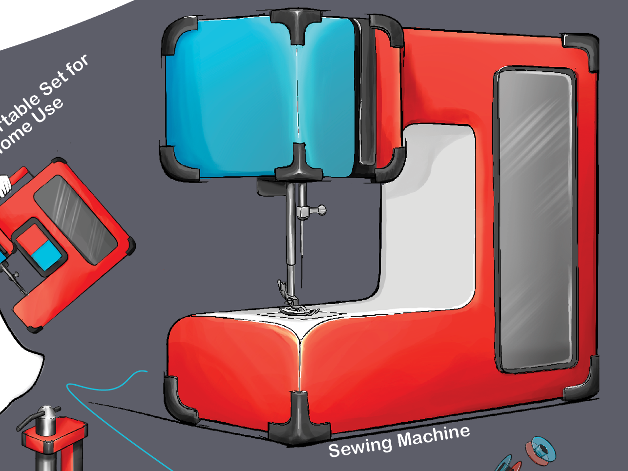
This project is an exploration of visual brand language. Using digital techniques, I analyzed two brands (Crown forklifts and the video game Spyro Dawn of the Dragon) for their visual brand languages. I then applied these to sets of simple shapes.
From there, I expanded the project by picking one of the brand languages to apply to other goods, one hard good, a sewing machine, and one soft good, a climbing harness. The process of this project includes visual brand analysis, digital thumbnailing, application of brand language, and product analysis.


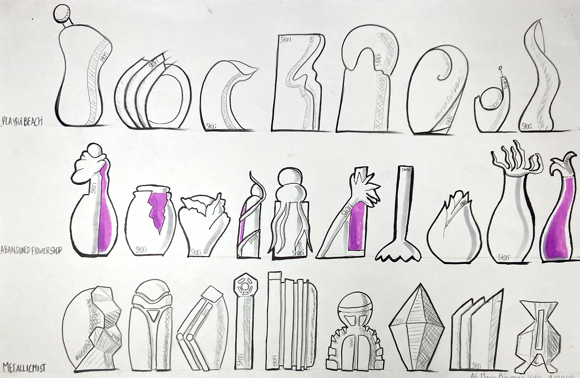
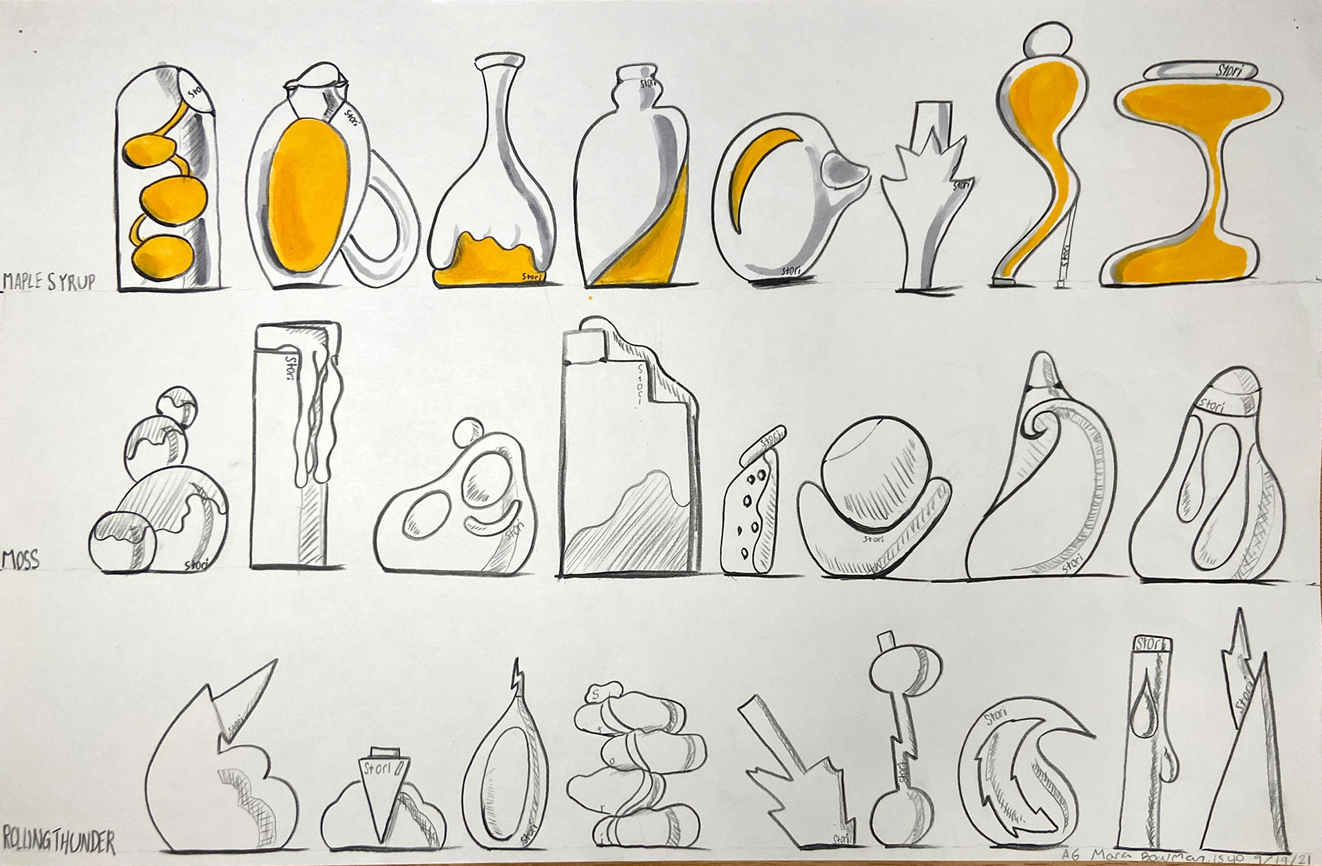
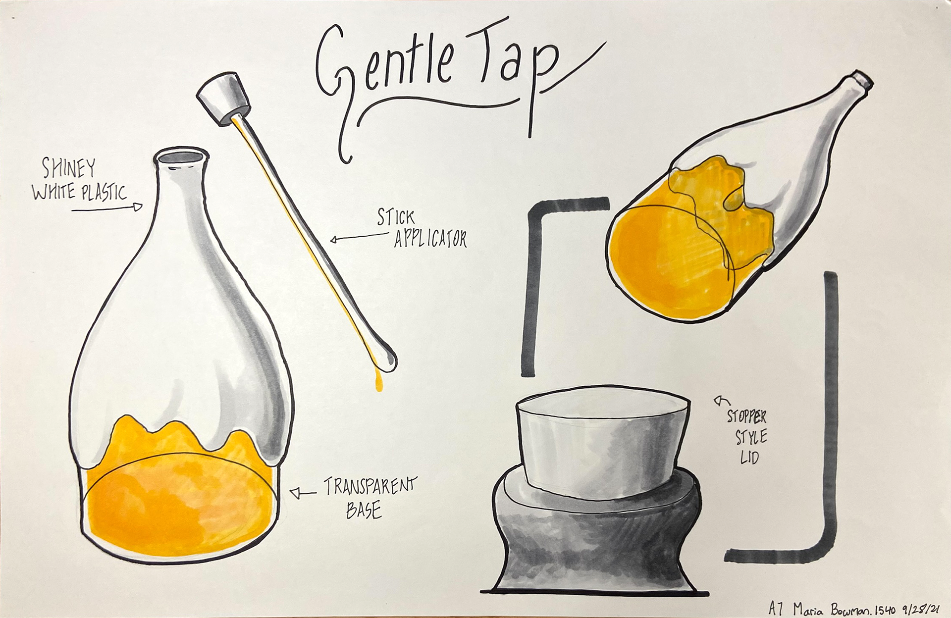
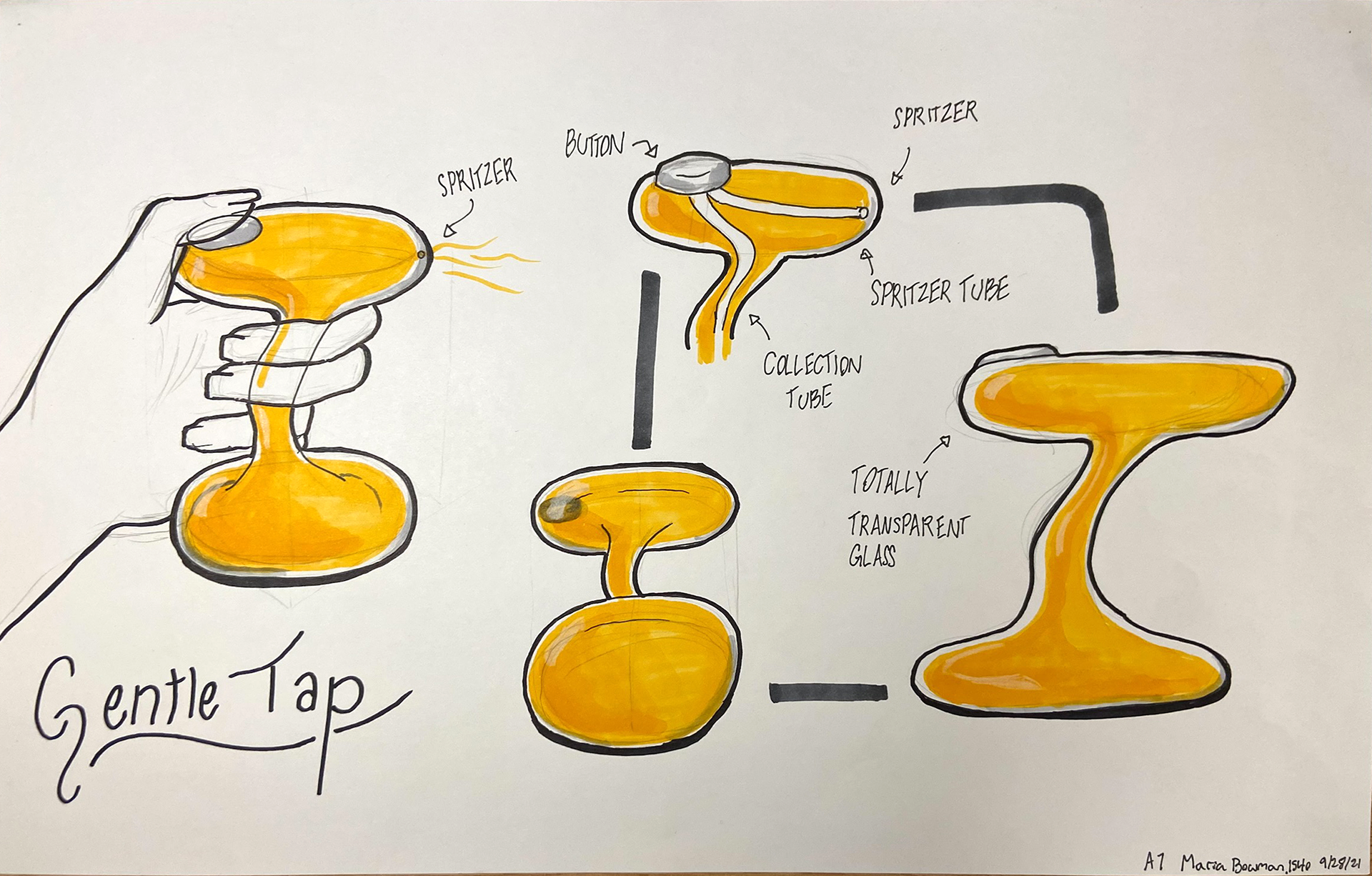
Perfume Bottle Project Sept-Oct 2021
This is a four week long project from fall of 2021.
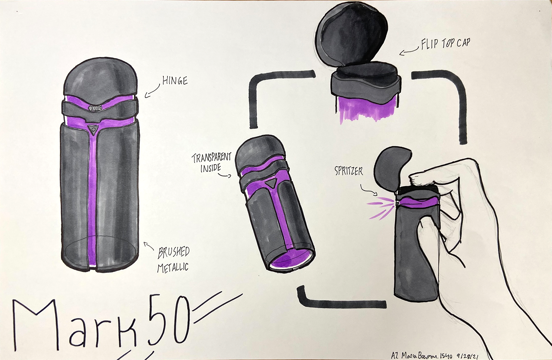
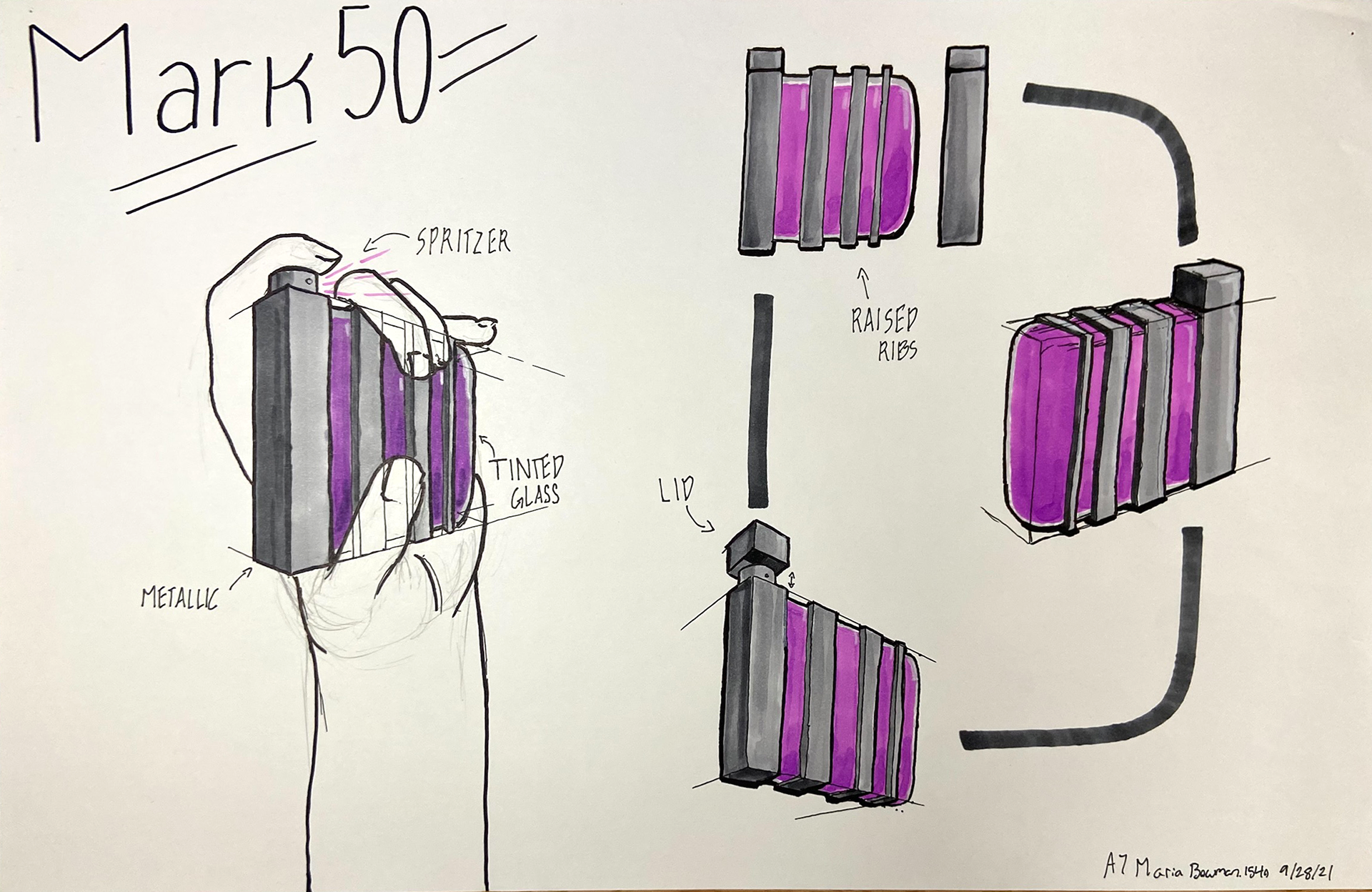
In this project I followed a complete design and iteration process for the first time. Starting with many themes of thumbnails, this project follows through to 3D thumbnails, 6 explanatory concepts, refinement thumbnails, and renewed explanatory sketches. You can see this process reflected later in my final project, albeit somewhat more neatly. The materials used for this project were prismacolor, pen, and copic marker. The final design themes, Gentle Tap and Mark 50, draw their inspiration from Maple Syrup and Iron Man respectively.
